We’re incredibly excited to announce the latest update to our Stats app, designed to improve the way you monitor and optimize your connectivity performance. With a fresh new design, enhanced user experience, and dynamic time charts, Stats empowers you to make data-driven decisions and ensure your business operates at its absolute best.
How can Stats help me? ![]()
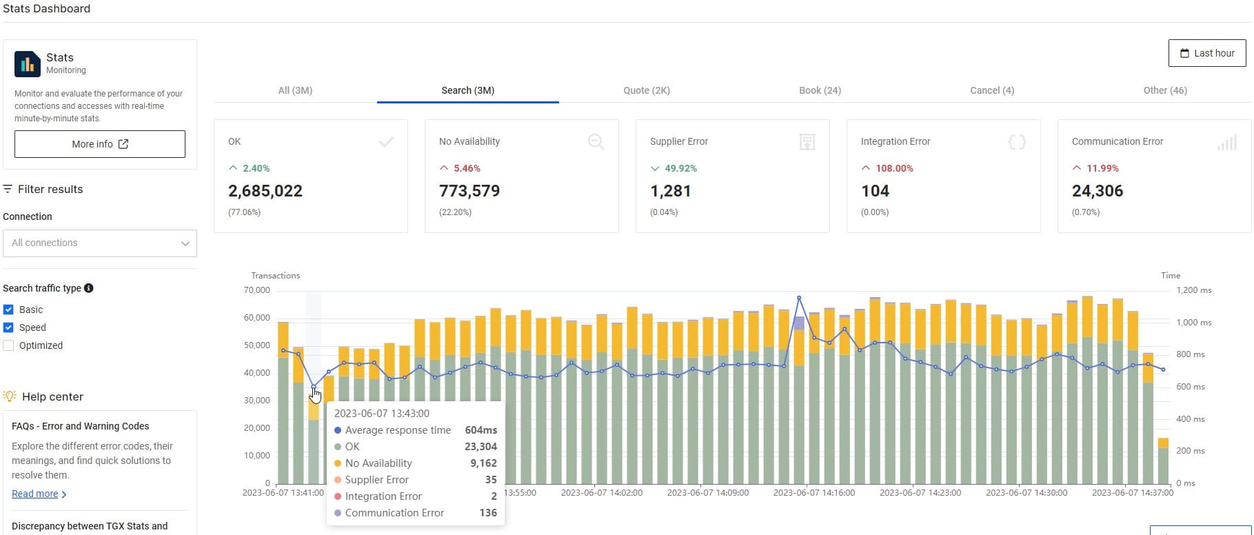
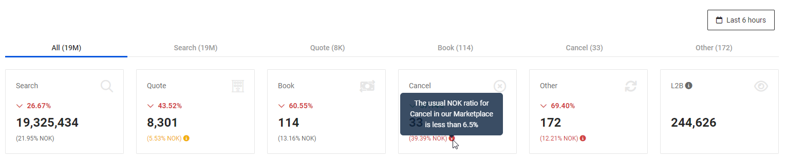
Stats is your ultimate partner in achieving business success. It allows you to effortlessly track and evaluate your performance, swiftly addressing any traffic or connection issues that may arise. With valuable insights provided on a per-connection and per-method basis (Search, Quote, Book, Cancel, and Other), Stats offers both a comprehensive overview and detailed performance information to drive your success.
What’s new in this version of Stats? ![]()
- New design: We’ve given Stats a makeover! With a fresh look and feel, navigating the website is now even more user-friendly. The sleek design enhances your experience, making it easier than ever to understand the statistics and filter results according to your own criteria.
- New time bar charts: It’s not just about reading the statistics anymore; now you can visualize them too! Our new dynamic time bar charts allow you to quickly understand how your traffic is performing. With just a glance, you can identify any anomalies in error rates or response times.
- Colors to show your connection status: You may have noticed that some of your connections have a yellow or red background. Don’t worry, we’re here to keep you informed about their status. With thousands of connections generating over 5 billion searches and 30,000 bookings each day in our bustling Marketplace, we have a wealth of data to help you out! Here’s what the colors mean:
- Green or uncolored
 : Excellent error ratio, indicating flawless performance.
 - Yellow
 : Working well, but there is room for improvement. Fine-tuning error ratios can make it even better.
 - Red
 : Error ratio needs reviewing. Opportunities to reduce errors exist.
- Green or uncolored
Within each scorecard, you’ll find a percentage of NOK (not OK) transactions accompanied by an informative icon. Hovering over the icon reveals a tooltip, indicating the target percentage for these ratios.
To learn more about working with Stats and unlocking its full potential, check out our article here. ![]()
What do I have to do? ![]()
Accessing Stats is a breeze! Simply visit our website head to the APPs section and click on Stats. Once you’re in, you’ll see your organization’s statistics for the last hour by default.
Your feedback is crucial to us, please take a moment to leave your comments in the survey that will pop up when you check out Stats. We greatly appreciate your input!
Happy monitoring with Stats! ![]()